World Cube Association Website Assessment and Redesign
(Aug 2022-Dec 2022)
Reviewing existing systems and resolving its pain points in the globally operated World Cube Association website.

Overview
The software team of The World Cube Association approached the iConsultancy in finding UX specialist to improve their user workflows. After expressing my interest and supporting my candidacy with my background, I was appointed Project Manager and Design Lead. With many complaints being cited to the WCA’s registration system on their website, they are requesting for my team to re-assess and redesign their website.
Our team delivered the WST (WCA Software Team) several products based on the User Experience assessments and improvements. This included documents, sitemaps, high-fidelity prototypes, and interview data.
Tools
Figma
Photoshop
Slack
Miro
Google Sheets
Google Forms
Scope
Needs Assessment
Heuristic Review
UX Research
Background Research
Team Members
Bry’elle Monk
Manisha Christian
Ellis Deng
Mehdi Dinarsaki
My Roles
Project Manager
Design Lead
UX Researcher
Client Delivery
Background Research
The World Cube Association is an international non-profit organization, focused on hosting, supervising and organizing competitions for “twisty puzzles”, mechanical puzzles such as the iconic Rubik’s Cube. With their current goals to return competitions to a level prior to the pandemic, establishing corporate partners for funding, and expanding to other regions, a rise in traffic to their website will emanate.
For broader, more long term goals, the WCA eventually wants to be registered as an official registered sports organization having met all the requirements for membership of the Global Association of International Sports Federations. This will allow the organization to reach higher status and have more broadcasting opportunities. To meet this status, a better designed webpage, matching the prestige of a global sports organization will solidify its legitimacy in the future.
The WCA Website’s priority is to operate and house registrations. The WCA is sustained by events populated with official registrations, making their strongest connection to their community being their website. Being tasked to redesign this significant website also means contributing to the WCA’s efforts in reaching the status it desires.

Problem
Many competitors face frustration with the WCA’s current registration system. Some users don’t receive the right feedback on the status of their registration, leading them to think they’ve been approved to compete, to later find out they didn’t even complete their registration. This issue can scale further as entire families book entire hotels, plane tickets, and rental cars to reach the competition venue, to later be denied, all due to poor clarification on the WCA website.

Solution
What this information system is lacking, is the 2 prominent Usability Heuristics: Visibility of system status and Error prevention. For a system requiring user input/form completion, and a digestive feedback system, we used our UX research to identify the weaknesses of the current user workflows. We solved these weaknesses by implementing updated frameworks and cognitive signals throughout the entire workflow from browsing to submitting, making registrations easier and optimized.
Discover and Define
If we’re designing a gateway that brings world wide communities together, how do we start?
We connect with the community as an outreaching hand.

Instead of just following guidelines with our clients at the WCA, we formed a relationship with them, exchanged resources, ideas and grew our understanding of the organizers who depend on this system.
We were able to join the software teams’s business Slack, have access to the software team’s GitHub repositories, had a guided walkthrough of registrations by a WCA delegate, gained access to an official staging account as well as had forum priority access.
Collaborating with the WCA
The best way to understand the cubing community is through joining it. We were able to interact with users all over the world through the World Cube Association forum, conversing and generating discussion about cubing culture and how the registration pages play a role in this society of cubers. We met cubers from different ages and backgrounds and made our presence known as a team of designers working for a culture they enjoy. Our presence went to the extent of reaching the official cuber subreddit.
Joining the community
User Needs Assessment
After learning about the community we are supporting through design, it was time to understand what they need from a registration system.
Reaching cubers in the forum and subreddit, we interviewed based on registrations, user feedback, usability heuristics, customer experience, pain points and suggestive feedback to over 100 different cubers in the community.
Conducting the UX interviews allowed for our retrieval of what the user-based weaknesses in the system are, and how those weaknesses impact the cubing community. Asking open-ended questions allowed interviewees to describe their goals and purposes in their journey as a cubing competitor. It was my team’s job to translate those goals and purposes into design workflows.
We documented all of our findings, and formed an 8-page User Needs Assessment Report as a formal deliverable of this project. Below are example responses from interviews.
“I accidentally double my total because I thought the donations form was the mandatory registration payment”
“It’s hard for me to read through competition information, everything looks so crowded”
“Editing account events is easy and intuitive”
“I need a non-intrusive payment method”
“When a popular competition releases, I depend on the website to maintain its servers while I try to get a spot”
“It’s so easy to forget paying”
“Long waiting for approval is annoying since I do even know what spot I’m in on the waitlist”
“The map feature makes it way easier to find competitions nearby”
“It should be more clear as to whether or not submitting a registration means you can compete”
“The website looks very dated”
“I end up choosing all events to make registration faster, then having to ask the organizers to edit my registration”
“I don’t want to care or worry about registrations, just make sure I get approved and I go”
“It gets annoying trying to find which competition is open”
“Filtering based on region is the fasted way to reach my desired competition”
“I need a set of recommended competitions based on my location to find my indeed competition easily”
“I can’t tell whether or not my registration has been approved”
Website Assessment

Our goal is to create a new workflow from an existing system. In order to improve it, we must study why it has weaknesses that generate pain points for users. As project manager, I allocated different team members to different sections of the existing system. Our team investigated the current system’s strategies that fulfill user purposes and how those strategies are open to revisions. Each member was given a master doc of prominent user responses specific to their section, guiding them through user-centered analysis.
Using our established connections with WCA delegates, we were also given an exclusive in-depth walkthrough of the registration pages and an examination of the administrative back-end workflows that support these pages. Walkthroughs with several cubers using mock registrations were scheduled after, with team members observing and collecting behaviors and insights of user workflows.
Generating results based on the company, users, and our team’s UX knowledge resulted in complete comprehension of the current system’s flaws, strengths, and capacity for change. This was all formally documented in a 10-page final report of website findings and recommendations, a primary deliverable for our client.
Example Findings


Design
After generating findings and recommendations formed to meet user needs, it was time to visualize our improvements onto a new work flow.
Keeping what’s familiar, improving the weaknesses
The WCA and its community have a clear design language when it comes to its visual designs, websites and merchandise. We want cubers to still feel like they’re at home with our redesigns. By consistently requesting feedback, referencing the existing website and using our findings, we were able to make an improved website with the design language of the WCA.
Design Solutions
Below is our design solutions to the primary user problems faced on the WCA’s current system.
Problem:
"The competitions database just overloads me with competitions that are irrelevant to me”


User Need:
The primary goal users have when opening the Competitions screen is to find a competition nearby and register as fast as possible. Being greeted with a web page with an overwhelming amount of results may cause information overload.
Solution:
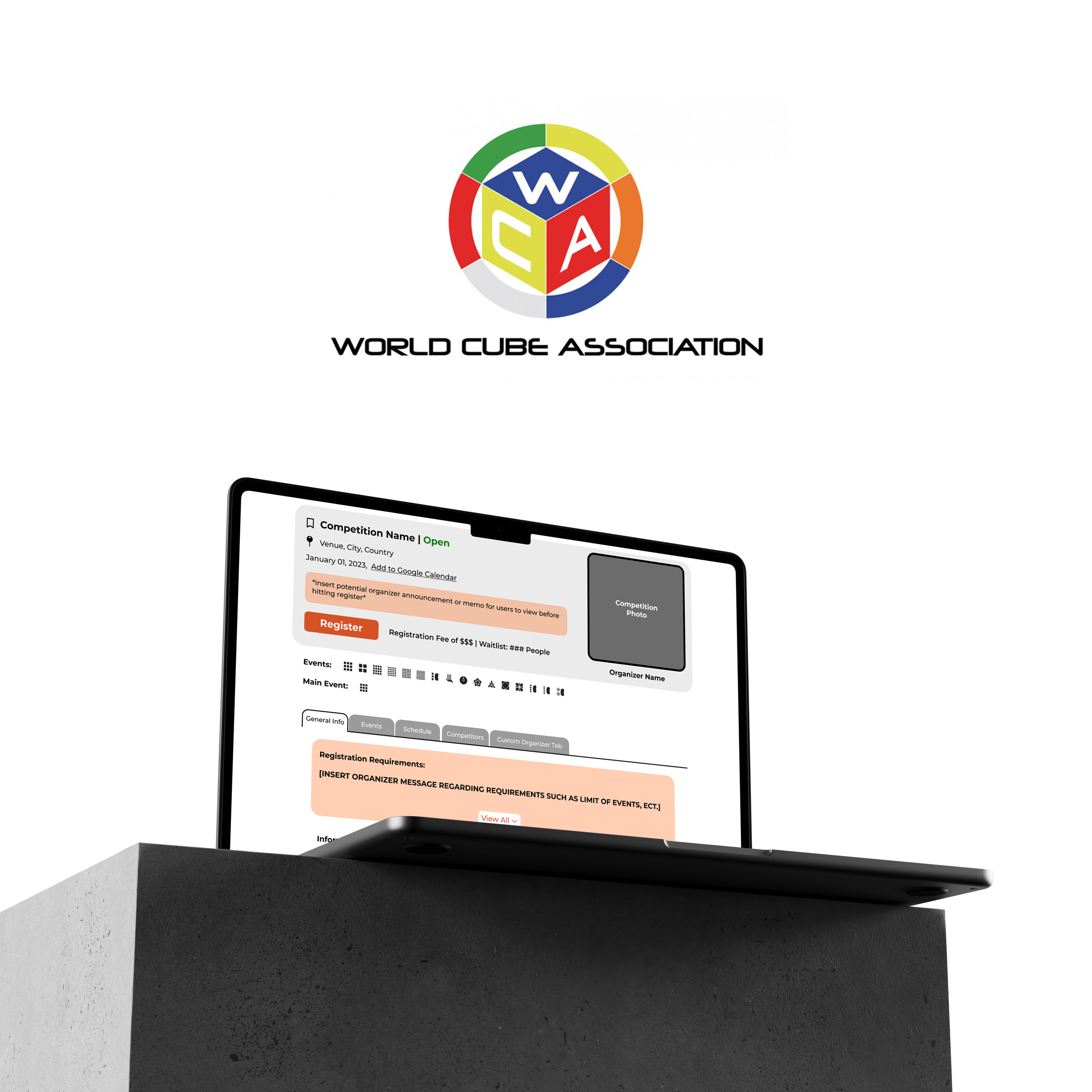
Give each competition entry its own, larger space, optimizing info throughout its larger region in the database. This will make the database look more like a catalog of competitions rather than an elongated list. Make relevant competitions be the priorities results met based on proximity filters based on consented user location.

Problem:
“After submitting my registration, I never made it out the waiting list. I didn't even know I was on the waiting list because I thought I was already approved after hitting “Register!”.”


User Need:
Competitors must have a streamlined registration process to reach complete submission in a singular workflow. Currently, the website makes payment separate from registration, despite payment being a requirement for approval. After submission, users require visibility of their registration status. This is for feedback and validation on their previous efforts in browsing, enrolling and submitting a competition registration.
Solution:
Place all required forms and registration steps under a single page, rather than requiring payment after form submission. This will condense all of the required processes into one connected workflow, making it impossible to skip processes that grant approval. Design with insistent feedback. Let users know what status their submission is through process bars, prompts, repetitive alerts and definite wording. This makes the website more instructive and dependable as a resource and system.


Problem:
“It’s hard for me to read through competition information, everything looks so crowded.”

User Need:
Users must be able to identify essential information regarding these requirements when landing on the competition page. These pages work as a resource to attendees and allow for the displaying of several languages based on the event’s country; failure in doing so results in a poor webpage.
Solution:
Stress a visual hierarchy with segmentation of previously crowded information. Use of drop-downs, hovers, prompts and rearrangement of static components allows for easy engagement and digestion of information. This invokes an interactive relationship between the competition information and its potential competitors.

Sitemap

Final Product Walkthrough

Gregor Billing, Head of World Cube Association Software Team at our team’s Design Delivery meeting
“I am just processing all of the awesomeness I have seen in the last 10-minutes right now…it is a lightyear jump compared from what we currently have and I think that especially newcomers and not so regular competitors who want to try their first cubing competition are going to be very appreciative of this redesign.”
Impact on my UX Journey
This was my first client experience, as well as my most thorough case study to design for. Being able to establish empathy, and immersing myself in the communities I design for showed me the fulfilling work this field is capable of. Working as a lead UX designer taught me the disciplines beyond wire-framing and allowed me to truly understand the role that conceptualization and research have in support of UX/UI design. Under the command of a company, I learned how to establish relationships with our client as our goals for this project aligned and pushed our ambitions further with team efforts.
Being able to interconnect and curate ideas from my team, users and our client is a process I will never forget and taught me management disciplines that I can use for my professional future.